If you’ve been looking at my online photography portfolio you may notice that there’s a variety of images presented in both Black and White AND Colour. Some photographers choose only to provide images in monochrome whilst others build a name for themselves on the basis of providing only colour images. For me however, the merits of each individual image must be considered when deciding whether the image should be presented in colour or black and white. So, I thought I would share with you 3 key elements I refer to when deciding.
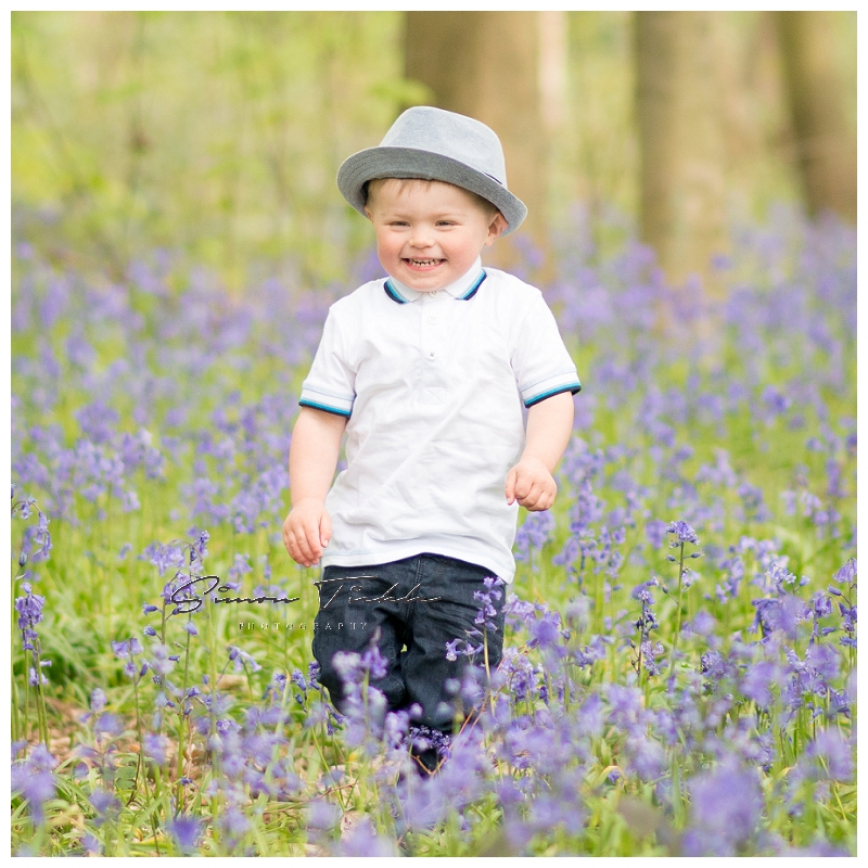
Impact. Does colour ‘make’ the image? Does it add to or distract from the subject in the image. Where do I want the viewers focus and attention to be placed in the image? Would this area be more or less obvious if colour was removed? For example, in the bluebells image below, it wouldn’t be logical to make a black and white conversion as the image is all about the colour – the blue bluebells. However, if I wanted the impact of an image to be the emotion – maybe the love between two siblings – rather than the environment they were in or the clothes they were wearing, it would probably work well as black and white.
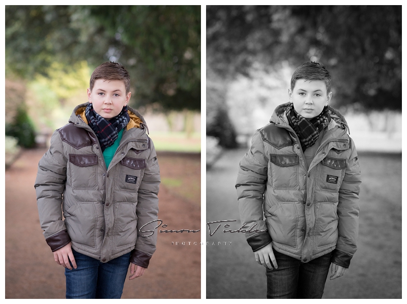
Tone. Is there a full tonal range of colour in the image? When you remove the colour, you only have tone to differentiate between the highlights and shadows. If there is no tone (ie, a white wall and the super smooth skin of a young baby), the images don’t look as compelling in black and white.

Textures. Black and White generally enhances texture making it more obvious to the viewer. Textures are things like pebbled pathways, wrinkles in the skin and freckles. For ‘gritty’ scenes with lots of texture a contrasty black and white can work well.

Occasionally, an image will have enough qualities to look awesome in BOTH black and white and colour. In this case, I refer to number 4.
Feeling. OK, so this ones less technical, but sometimes an image just ‘feels’ right either in black and white or colour.
So there you have it. A 3 (OK 4!) step guide to deciding which images should really be Black and White. I’d love to know whether you prefer images in Black and White or Colour? Feel free to leave me a comment.